


Magazine Ad
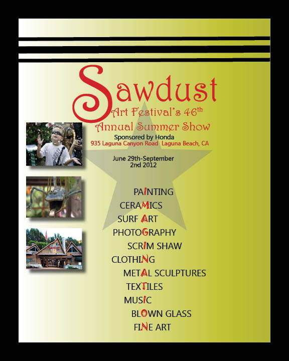
After doing research on the Sawdust Art Festival, I chose the color scheme of the green and red for my advertisement because it was what the Sawdust company used on their website. To get the colors exact, I placed an image of the Sawdust company emblem into InDesign and used the dropper tool to get the exact pigment for my color swatches. Instead of listing out all of the things this festival had to offer, I creatively put the word "Imagination" in al of the words. Also, I used three photos taken at the festival to allow the audience to get a sense of how magical and fun this festival is. I wanted these photos to pop outof the page, so I inserted a drop shadow behind each photo. I used the same three fonts throughout the entire advertisement to achieve a clean and organized look.